The mainline entries in the Final Fantasy series feature a uniform logo design created by artist Yoshitaka Amano, including not only the title of the game but characters and imagery that are important to their respective stories. The exact meaning behind these logos isn’t always apparent, but they all show something key to their respective game.
The Final Fantasy logo design wasn’t cemented until FF4. The original three games initially used a totally different design, with a much wackier font that didn’t feature any additional images. And while Amano worked on the Final Fantasy series from the beginning, his logo design wasn’t introduced until FF4, with the first three games retroactively receiving new logos alongside releases.
Related: Stranger of Paradise: Final Fantasy Origin is an earnest and enjoyable experience – Review
Final Fantasy I’s Logo Features The Warrior Of Light
Amano’s design for FF1 was introduced with the Final Fantasy Origins remake on PS1. The logo shows the Warrior of Light, which is based on concept art created for FF1. Interestingly, this design became the default incarnation of the FF1 protagonist, even though the game doesn’t have one, as the player forms a party of adventures based on jobs. Tetsuya Nomura would later refine this design for use in the Dissidia series, where the Warrior of Light acts as the representative of FF1.
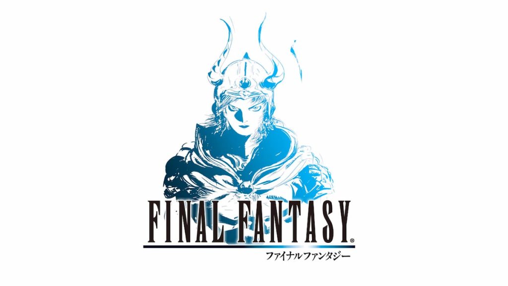
A second logo was released for the 20th anniversary of FF1, which has been used with multiple projects since. It’s a similar image of the Warrior of Light, though he is facing the front this time. This incarnation of the Warrior of Light is also seen in Stranger of Paradise, though he is a foe in that game, as the player controls Garland: the main foe of FF1.
Final Fantasy 2’s Logo Features Emperor Mateus
Like FF1, FF2 received an Amano logo as part of the Final Fantasy Origins release on PS1, with the previous logo containing text. In contrast to the FF1 logo, FF2 features the game’s main antagonist: Emperor Mateus. The lifted chin pose references his utter belief in his destiny to rule over others, which he does in both life and death.
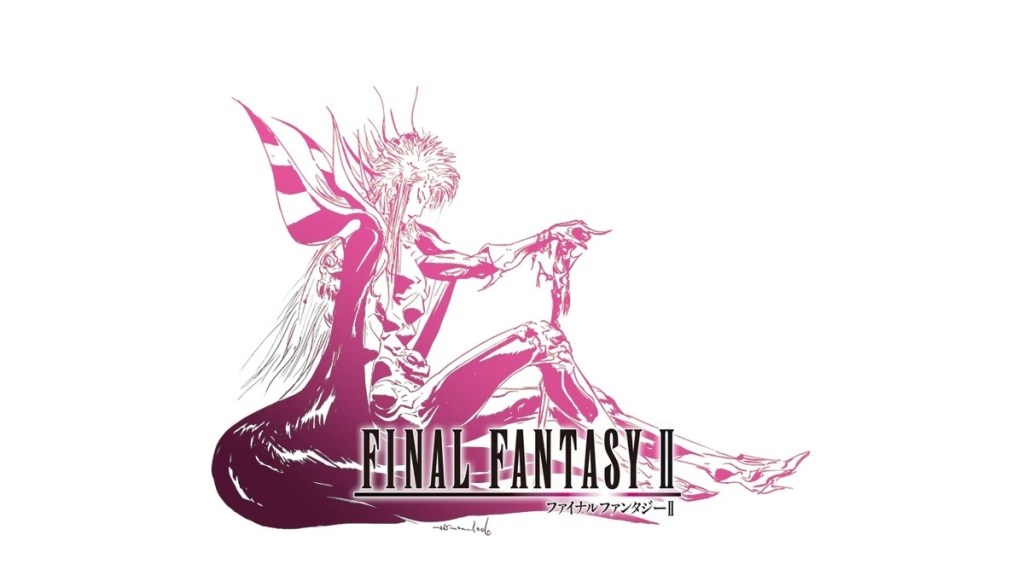
FF2 also received a 20th-anniversary logo, with Emperor Mateus facing to the right. This contrasts the FF1 logo, where the Warrior of Light faced left in the original artwork before switching to facing forward in the 20th-anniversary art.
Final Fantasy 3 Features A Dual-Wielding Warrior Of Light
Final Fantasy fans outside of Japan had to wait a long time to play FF3, as it didn’t receive a remake until it came to the Nintendo DS in 2006. The Amano artwork created for the game features a Warrior of Light wielding two swords, possibly referencing the incredibly powerful Ninja job that can be unlocked near the end of the game. Unlike the Warrior of Light from FF1, the FF3 character wasn’t used as the basis for the game’s Dissidia representative, who was based on the Onion Knight job.
Final Fantasy 4’s Artwork Features Kain Highwind & Golbez
FF4 was the first game in the series to use Amano’s artwork. The logo is straightforward, featuring Kain Highwind posing with his lance. Kain is one of the main characters in FF4 and acts as a party member, enemy, and rival at different points in the story. Other Dragoons often reference Kain’s pose in the logo throughout the series while standing on one leg and holding a lance.
When FF4 was remade on the Nintendo DS with full 3D graphics and enhanced gameplay systems, a new logo was created to differentiate from the game’s original version. This new artwork showed Golbez, the game’s villain, looking at his open hand, possibly hinting that he isn’t fully in control of his actions.
Final Fantasy 5’s Logo Features A Wind Drake
FF5 easily has the most generic logo in the series, featuring one of the wind drake dragons that is used as a mount throughout the game. It’s unclear why one of the heroes or villains wasn’t used, especially as Amano has drawn many pictures of Faris over the years. A character like Gilgamesh also has a striking design and would have made for an excellent logo figure.
Final Fantasy 6’s Logo Features Terra Branford
The FF6 logo is actually the first one to depict the protagonist of one of the games, not counting the logos created for remakes. This logo shows Terra Branford at the start of FF6 when she is under the control of the Empire and forced to ride a Magitek suit into battle. Luckily, Terra breaks free from their control, so she is only seen piloting this suit for a brief period of time.
Final Fantasy 7 Features Meteor & The Life Force
FF7 has one of the best logos in the series, as it has a dual meaning. On the surface, it looks like the Meteor that Sephiroth summons using the Black Materia, which is set to destroy the world and will allow him to become a god. The logo also refers to the fact that the life force of the planet is being drained away by the Mako Reactors, with a scene featuring Bugenhagen depicting the world’s energy fading away, resembling the image in the title.
Final Fantasy 8’s Logo Features Squall Leonhart & Rinoa Heartily
FF8 was the first game in the series to feature a love story prominently. The romance between Squall Leonhart and Rinoa Heartily was a major part of the plot, so it’s fitting that the two of them locked in an embrace would be the logo for the game. According to Final Fantasy News, the red and yellow gradient also references the game’s opening cinematic, which featured a similar color scheme.
Final Fantasy 9’s Logo Features
FF9’s logo features a crystal, which is an important part of the game’s lore, as they’re the source of life in the universe. This might seem like a lazy design, in the same vein as FF5, but there’s more going on here. It’s possible that a crystal was used for the FF9 logo because it was seen as a throwback to the earlier entries in the series, which prominently featured crystals in their stories.
Final Fantasy 10’s Logo Feature’s Yuna Performing The Sending
FF10’s logo has a beautiful design, even though it evokes one of the saddest moments in the game. The logo depicts the summoner Yuna as she performs a ritual called the Sending. The Sending is a dance that allows the souls of the dead to pass into the afterlife. If a Sending isn’t performed, then the souls run the risk of returning as monsters.
Final Fantasy 11’s Logo Features Player Characters
The FF11 logo had a difficult task ahead of it, as it was the first MMO in the series, which meant that players would be allowed to customize the design of their characters for the first time, so there were no protagonists to use. To this end, the logo features an army of heroes, depicting the different playable races and jobs that appear in the game, which was the best approach to take.
Final Fantasy 12’s Logo Features Gabranth
FF12’s logo features Judge Gabranth, his head held high and a blade in each hand. Gabranth is a major villain in the game, and the gorgeous and imposing design of the Judge’s armor probably made the decision to use him in the logo an easy one. This logo might have helped Gabrath’s popularity in other ways, as he was later chosen to represent FF12 in the Dissidia series, even ahead of its own protagonist.
Final Fantasy 13’s Logo Features Cocoon
On the surface, FF13’s logo looks like the continent of Cocoon, one of the game’s main locations. If you look closely, you can see Fang, Vanille, and Ragnarok wrapped around, referencing the story’s events. The logo’s overall shape is also referenced in Serah’s engagement pendant, which has a similar design. Like FF13 itself, the logo is hard to understand by casual observers.
Final Fantasy XIV’s Logo Features Warriors Of Light
Like FF11 before it, FF14 is an MMO. This means it faced the same challenges regarding logo design, and the same approach was used, as FF14’s logo features fourteen Warriors of Light all facing different directions. The design here is a little better than the one used by FF11, as there is a more diverse selection of character types here, making them look more like an adventuring party.
Final Fantasy 15’s Logo Features Lunafreya
FF15’s logo is unique in that it changes at the end of the game. The logo’s base version features Lunafreya, the Oracle of the world with the power to heal others. Lunafreys is shown sleeping while the moon hangs behind her, and a wing sprouts from her body. According to Gematsu, the logo’s imagery references a closed eye.
Once you complete the game, a new logo is shown, depicting Lunafreya reunited with Noctis. This is meant to be a heartwarming act of closure to the game, as the two are finally together after being separated throughout the game.
Related: Final Fantasy 17: Will There Be One?
Final Fantasy XVI
Now that FF16 is out, the meaning of its logo has been revealed. This logo depicts the Phoenix and Ifrit Eikons battling, which is a scene that happens at the start of the game. The fight between these two colossal beasts sets off the story’s events and is one of the most visually impressive cinematics in the franchise’s history, which explains why it was chosen for the logo.


Published: Jul 2, 2023 11:26 pm